
Posters continue to serve a clear function in 2026: they communicate quickly in physical spaces where attention is limited. Whether announcing an event, promoting a sale, or sharing internal information, a well-structured poster can convey a message in seconds.
The challenge for many beginners is not creativity but translation—turning an idea into a clean, printable layout. Poster design software simplifies that process by combining preset dimensions, structured templates, and drag-and-drop editing tools. Instead of starting from a blank canvas, users can work inside proven layout systems.
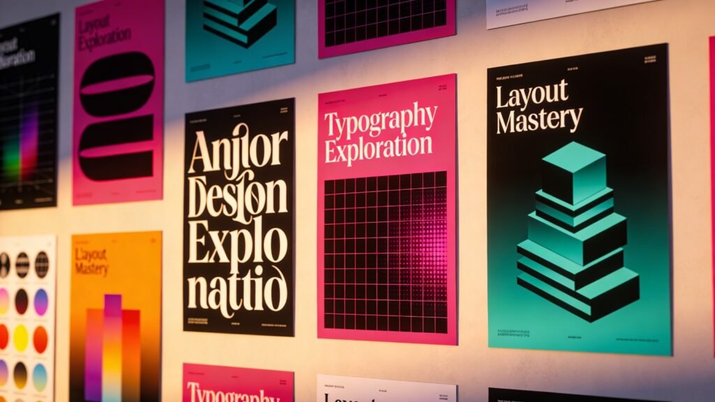
A practical starting point is to create a printable poster from Adobe Express, which provides built-in sizing, alignment guides, and export settings optimized for print. From there, the workflow outlined below applies broadly to poster design software in this category.
Step-by-Step How-To Guide for Using Poster Design Software
Step 1: Define the Core Message and Choose a Structured Template
Goal
Clarify the poster’s purpose and select a layout that supports it.
How to do it
- Write a one-sentence summary of what the poster must communicate.
- Identify the single most important detail (date, discount, announcement, etc.).
- Open your design tool and filter templates by use case.
- Choose a template that supports strong visual hierarchy.
- Lock in orientation (portrait or landscape) before editing.
What to watch for
- Avoid templates overloaded with decorative elements.
- Do not choose a layout that compresses critical information.
- Confirm the preset matches your intended print size.
Tool notes
For typography experimentation or testing font pairings before finalizing your layout, a tool like Fontpair can help compare complementary font combinations without redesigning the entire poster.
Step 2: Set Dimensions and Resolution Correctly
Goal
Ensure the file is print-ready from the beginning.
How to do it
- Confirm final print size (e.g., A3, 11×17, 18×24).
- Ensure resolution is set to 300 DPI.
- Enable bleed settings if printing edge-to-edge.
- Establish safe margins for text placement.
- Avoid resizing the canvas after content is added.
What to watch for
- Designing at screen resolution (72 DPI) leads to blurry prints.
- Forgetting bleed may create unintended white borders.
- Scaling up low-resolution designs reduces image clarity.
Tool notes
If you need to double-check DPI or adjust PDF export settings, a PDF utility such as PDF-XChange Editor can verify print resolution before sending files to a printer.
Step 3: Build Clear Visual Hierarchy
Goal
Make the message readable at a glance.
How to do it
- Place the headline prominently at the top or center.
- Use large font size for primary information.
- Reduce secondary details to smaller supporting text.
- Align elements consistently using built-in guides.
- Limit the design to two or three font styles.
What to watch for
- Too many fonts weaken clarity.
- Center alignment is not always the most readable option.
- Text blocks should not compete for attention.
Tool notes
If you want to test readability at scale, tools like Stark (for accessibility checks) can help assess color contrast and legibility before final export.
Step 4: Select a Focused Color Palette
Goal
Maintain cohesion and print accuracy.
How to do it
- Choose 2–4 primary colors.
- Maintain strong contrast between text and background.
- Align with brand guidelines if applicable.
- Preview the design in print mode.
- Keep background imagery subtle when text overlays it.
What to watch for
- Highly saturated digital colors may print darker.
- Light text on patterned backgrounds reduces readability.
- Excessive color variation distracts from the message.
Tool notes
For verifying contrast ratios and accessibility compliance, a standalone tool such as the WebAIM Contrast Checker can help confirm that text remains readable when printed.
Step 5: Use High-Quality Images and Graphics
Goal
Enhance professionalism without reducing print quality.
How to do it
- Upload original, high-resolution images (300 DPI minimum).
- Avoid enlarging small files beyond their native size.
- Crop proportionally to prevent distortion.
- Use vector icons when possible.
- Maintain visual consistency in imagery style.
What to watch for
- Screenshots often lack sufficient resolution.
- Pixelation may not be visible until export.
- Too many images create clutter.
Tool notes
If compressing image files for efficient storage without reducing print quality, a utility like TinyPNG can optimize files before uploading them into your design.
Step 6: Prepare the File for Print Export
Goal
Generate a production-ready file.
How to do it
- Run a spelling and grammar review.
- Confirm margins and bleed areas.
- Export as PDF for Print when possible.
- Review the exported file at 100% zoom.
- Confirm embedded fonts.
What to watch for
- Avoid heavy compression settings.
- Double-check orientation before printing.
- Confirm correct color profile if your printer specifies one.
Tool notes
To review print proofs collaboratively, a file-sharing platform like Dropbox can simplify sharing high-resolution PDFs with colleagues before final approval.
Step 7: Coordinate Distribution and Tracking
Goal
Ensure the poster reaches its intended audience.
How to do it
- Confirm printing quantity and placement locations.
- Align posting date with event timing.
- Share a digital version across relevant channels.
- Archive editable files for updates.
- Track where posters are displayed.
What to watch for
- Printing too early can result in outdated information.
- Poor placement reduces visibility impact.
- Keep version control clear if updates are required.
Tool notes
Project management platforms such as Asana can help track deadlines, approvals, and distribution logistics once the design phase is complete.
Common Workflow Variations
Event Promotion Poster
Emphasize date and location first. Use bold hierarchy and minimal descriptive text.
Retail Sale Poster
Highlight discount percentage prominently. Maintain strong contrast for quick readability.
Educational Poster
Use structured sections and bullet points. Prioritize clarity over decorative graphics.
Internal Office Poster
Keep the layout clean and information-dense without visual noise.
Checklists
Before You Start Checklist
- ☐ Core message finalized
- ☐ Print dimensions selected
- ☐ High-resolution images prepared
- ☐ Brand colors confirmed
- ☐ Deadline and print logistics set
- ☐ Budget confirmed
- ☐ Distribution plan drafted
Pre-Export Checklist
- ☐ 300 DPI confirmed
- ☐ Bleed enabled if required
- ☐ Fonts embedded
- ☐ Spelling checked
- ☐ Color contrast verified
- ☐ Layout reviewed at full scale
- ☐ Correct file format selected
Common Issues and Fixes
Blurry images after printing
Replace low-resolution files and confirm 300 DPI before export.
Text too close to trim edges
Increase margin spacing or activate safe zones.
Unexpected color shifts
Preview in print mode and avoid extreme saturation.
Layout feels cluttered
Remove non-essential decorative elements and increase white space.
Poster hard to read from distance
Increase headline size and simplify supporting text.
How To Use Poster Design Software: FAQs
Is a template necessary for beginners?
Templates reduce layout errors and accelerate production, particularly for first-time users.
What is the best export format for printing?
PDF for Print preserves layout integrity and resolution.
How many fonts should I use?
Two to three fonts typically maintain clarity and hierarchy.
Can large-format posters be created in beginner tools?
Yes, provided dimensions and resolution are set correctly from the beginning.
Should I design for print or digital first?
If physical display is the priority, design at final print size first and resize for digital later.